Morning Art Digital Detox Day 2

Day 2 of Coffee Sketch

Didn’t have a good day yesterday, so the feeling like I woke up and accomplished something felt pretty good. I have a sorceress character in Dragon Rider’s Dance book 2 and have been looking for inspiration for her character design. Anne Stokes is very well known for her paintings of beautiful women as well as dragons, so the beauty/beast motif she has really works.

Oh, also, Ari wanted to be in the picture too, so that’s her on the coffee mug. I am selling it on my Shopify store. I have T-shirts attached to my instagram account, but I still need to figure out how to get the coffee mugs on there too…

Morning Art Digital Detox Day 1

I just got back from the family cabin over Labor Day weekend!

One of the nice things about being out there is there’s no cell service or internet. So even if something was on fire back home, there’s literally nothing you can do about it. It was a very much-needed digital detox. Didn’t get a lot of drawing done, but I did do a lot of reading, which I never do.

I realized that it’s been several years since I’ve done anything traditional-art related. I’m pretty good at digital, but there’s so many cheats and shortcuts that it becomes easy to lose certain skills. I also have tons of art books that I’ve been meaning to look at and study, but never got done.

For the next 30 days, I’m starting the first 30 minutes of every morning without technology. Basically doing a traditional drawing/study (bonus points if it includes dragons). Today’s victim is Anne Stokes and her piece, “The Dragon Trainer”.

Also one of the nice things is that because these are studies are contemporary masters, I can’t sell them. This is all about the enjoyment and practice. Which removes the pressure!

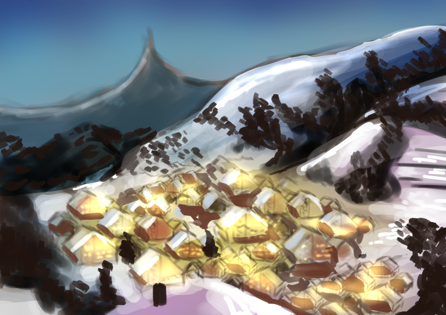
Day 15 of the 30 Day Fantasy Background Challenge: Matterhorn, Switzerland

Don’t have a lot of time this morning, but I saw this photo on the Microsoft Edge landscapes that they show when you first turn on your computer, but I forgot to get the original photographer because I suck. Hopefully it’s open source, but if not, if you guys know, could you drop a link?

Anyway, wanted to do a winter scene.

Reference

Original

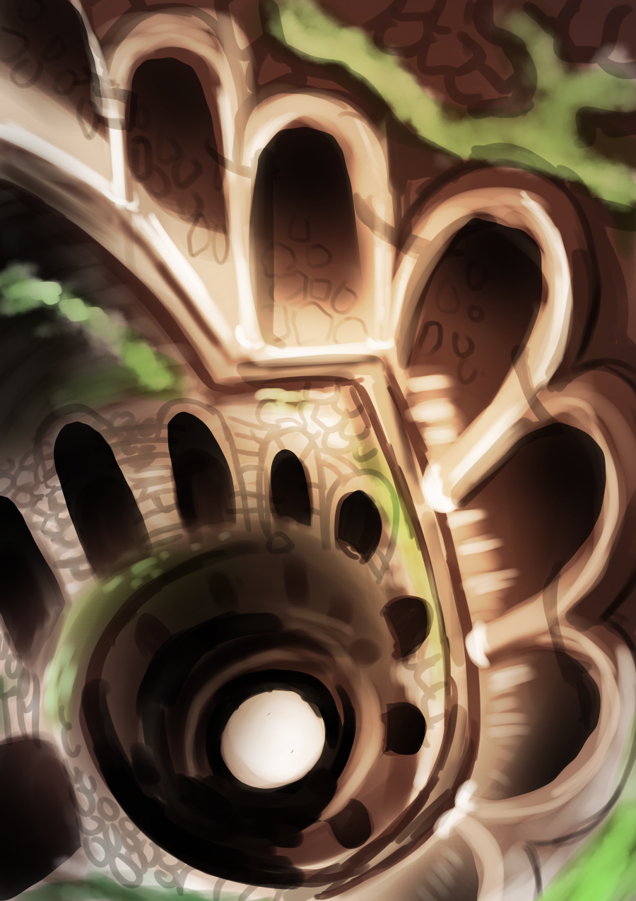
Day 14: 30 Day Fantasy Background Challenge, Quinta Da Regleira

Actually happy with how this one turned out. Went on Pinterest and looked through my various DRD mood boards and found this spiral staircase. Dragons have a thing for towers and spiral staircases.

This is an image of Quinta Da Regaleira (if you click the image, it’ll take you to the original image link). Supposedly, it was a masonic initiation well. Actually, my grandpa was a freemason. Wishing he was still here so I could ask if he knew anything about that.

At any rate, it’s still a cool, fantastical image. Again, dragons, princesses, towers, spiral staircases, you can bet I’m gonna be using this place as inspiration somewhere in the actual story.

Oh! And then of course, what did we learn?

I actually found that using 4 “colors” for the underpainting was helpful.

  1. Base color/wash (using the paintbucket tool to color the whole thing)
  2. Brown
  3. Dark Brown
  4. Black – Darkest shadows

Reference

My Version

Thanks everyone for joining me today! If you would like to take part in this challenge, please put a link in the comments so I can see your progress! Please read my comic, Dragonrider’s Dance on dragonridersdance.com or Webtoon Canvas! It’s an exciting fantasy/fairytale/action comic about a world where dragons are all female and disguise themselves as princesses!

Day 13: 30 Day Fantasy Background Challenge: Belle’s Ballroom

So, I might have bitten off more than I can chew here.

If I was to do this again, I would have put in the highlights before moving on to colors. (Normally, I do, but I dunno, I guess this is the one time I thought I could get away with it or something. There were also too many details than you could reasonably put in a 30-minute timeframe.

I’m also beginning to wonder if early morning isn’t really my time. I’m really happy with how the Sleeping Beauty Ballroom/stairs turned out, and I actually ended up doing this later in the afternoon, whereas the last few backgrounds I did around 5am or so.

Another reason why I don’t know if morning is really my time because after several hours of working on a commission, and just being tired, I took a quick break and did this portrait of Patricius which only felt like it took 30 minutes, maybe an hour tops: This is probably the second-best portrait I’ve ever done. I have more experience with portraits and enjoy them more, but even so.

Reference

My Version

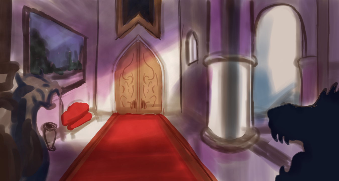
Day 12: 30 Day Fantasy Background Challenge

The hallway going into Belle’s Ballroom…

Reference

My Version:

I think I might have gone a little too heavy on the purples. It looks more like it’s being lit by purple lights rather than the natural purple that comes with the morning that I think this scene takes place in. This could be fixed by muting the colors. There’s other problems- like the fact that it was drawn at 4am and I was probably too tired to draw this, but I don’t care!

I’m currently working on a massive commission (I’m not allowed to share it, sorry) where I have to draw 64 rough colored sketches this month- most of them happened to be landscapes, and this exercise forced me to figure out how to make the best looking landscape in a short amount of time.

And that’s not all.

Because I’ve been more conscious of all the little things that go into a background- particularly in an indoor setting, it’s actually starting to come up when I work on personal stuff too. I put more background details in this drawing than I otherwise would’ve, and yeah, it really made a difference.

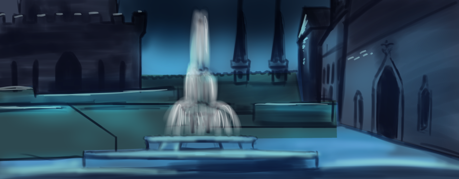
Day 11: 30 Day Fantasy Background Challenge: Sleeping Beauty Fountain

This is a spectacular failure.

Is this me saying my art is bad? No. I’m not allowed to say that anymore. In fact, I get annoyed when artists better than me call their art “bad” when they’re clearly better than me, so I’m not gonna do that.

I will say this though.

This is NOT better than yesterday. I was really happy with yesterday’s work, but today, not so much.

Here’s yesterday’s work for those just joining us:

So, here’s what happened.

  1. I tried an experiment, with the underdrawing being blue instead of brown. It doesn’t look as “dead” as when I tried black and white, but I don’t think the experiment was successful.
  2. I tried using the Linear Ruler in Clip Studio Paint. Trying to figure the new tool out ate up some time, and unfortunately, Clip Studio Paint’s ruler tool makes it harder to make more “organic lines” So, they look very thin and not very real.
  3. On that note, the “underdrawing”‘s lines are too think.
  4. If you look at yesterday’s work compared to today, I used broader brushstrokes to build up the shapes. To me, it looked slightly diagnal in some areas where it should have been straight, so I tried to fix that problem. Here… I think I was focusing on getting the lines right. I ended up not achieving my goal anywhere and making more problems
  5. The colors in the reference are warmer than my version. My brain was going, “Oh! Night! Cool colors!” But they’re TOO cold.

Lessons

  1. Focus on values first (shading and lighting). After drawing in the basic shapes, get the shading down before moving on to the countour lines and details.
  2. Be sure to have a balance of warm and cold colors.
  3. When you’re pressed for time, focus on a specific subject. I think if I were to go back and do this again, I would more roughly sketch in the buildings, and focus on making the fountain more detailed. Your eye is probably drawn more the background in my version.
  4. Probably the most important lesson: Sometimes improving a skill is 2 steps forward and 1 step back. If the goal is to be better than yesterday, then tomorrow will most certainly be better! Can’t wait!

Reference

My Version

Thanks everyone for joining me today! If you would like to take part in this challenge, please put a link in the comments so I can see your progress! Please read my comic, Dragonrider’s Dance on dragonridersdance.com or Webtoon Canvas! It’s an exciting fantasy/fairytale/action comic about a world where dragons are all female and disguise themselves as princesses!

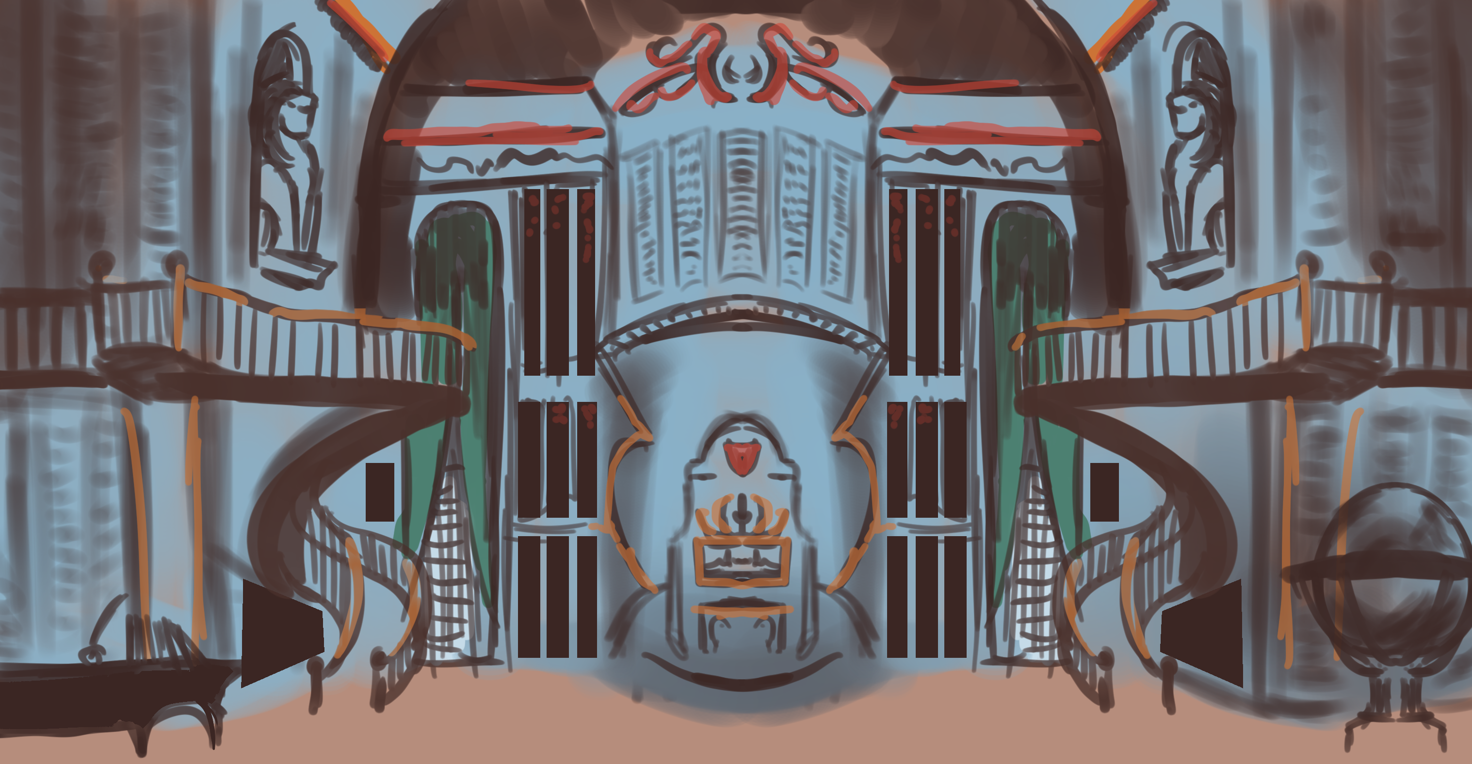
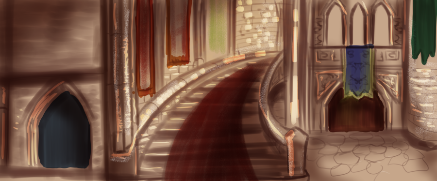
Day 10: 30 Day Fantasy Background Challenge: Sleeping Beauty Ballroom Stairs

Woot! Actually was happy with today’s piece. Interior backgrounds were REALLY hard to do.

Here’s a couple lessons I learned here

Rule of Thirds

  • If you look at the piece, 1 third is the area with the blue door, then the stairs, then the red door in the background.
  • The oil paint brush with the multiply tool is a great way of “glazing” the piece (when you basically paint the piece black and white, then paint thin layers of color over it)
  • Brown is still a good base color for indoor settings too. I was using brown as a base color the natural landscapes, but I tried using black and white for Day 8 (my first “indoor” background), but it still didn’t look right.

Reference

My Version

Thanks everyone for joining me today! If you would like to take part in this challenge, please put a link in the comments so I can see your progress! Please read my comic, Dragonrider’s Dance on dragonridersdance.com or Webtoon Canvas! It’s an exciting fantasy/fairytale/action comic about a world where dragons are all female and disguise themselves as princesses!

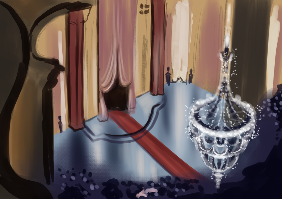
Day 9: 30 Day Background Challenge: Cinderella Ballroom

Since Dragonrider’s Dance has been promising a ball for almost two years probably, I think the next couple days, I’ll be studying the various ballrooms in the Classic Disneyverse. Starting with Cinderella’s ballroom.

But yeah, I think I’m starting to get a good grasp on outdoor landscapes and settings, so we’re moving more and more into architecture and interior. I’ll definitely attempt a village scapes (cityscapes, but medieval towns) towards the end of this challenge.

“But Ashley, you said the ball wouldn’t be a in a fancy ballroom, that it was gonna be more of a-“

“-Shaddup, Joshua!”

What Did We Learn?

All in all, I was trying to focus more on the texture- which I feel like is a fast improvement from yesterday, but proportions need work. I think I made the large curtain bigger because it’s the prominant subject, but it would have been better to spend a little more time on proportions.

It’s so easy to get lost in the details. I think the best thing to do is focus on treating a “room” like a box. Get the size of the “box” right, then move onto bigger elements, arches, columns, supports, then curtains, then so on. I tried painting the curtains first because that’s what I “saw,” but I think for tomorrow, that’s the thing to do.

Reference

My Version:

Thanks everyone for joining me today! If you would like to take part in this challenge, please put a link in the comments so I can see your progress! Please read my comic, Dragonrider’s Dance on dragonridersdance.com or Webtoon Canvas! It’s an exciting fantasy/fairytale/action comic about a world where dragons are all female and disguise themselves as princesses!