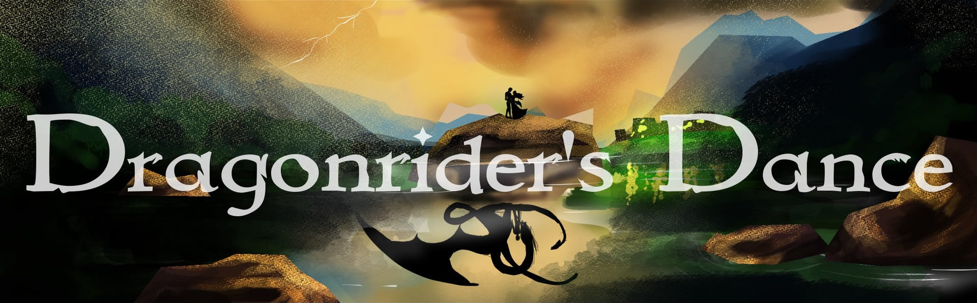
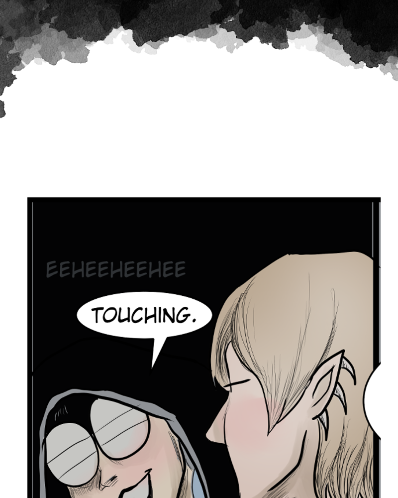
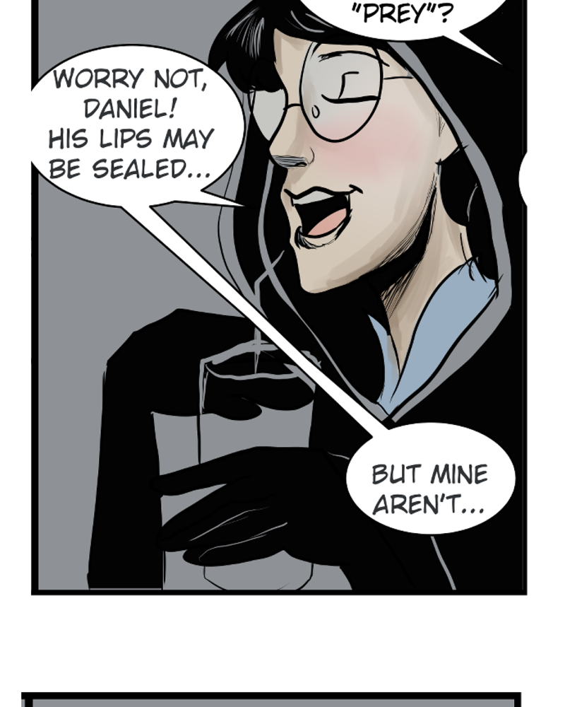
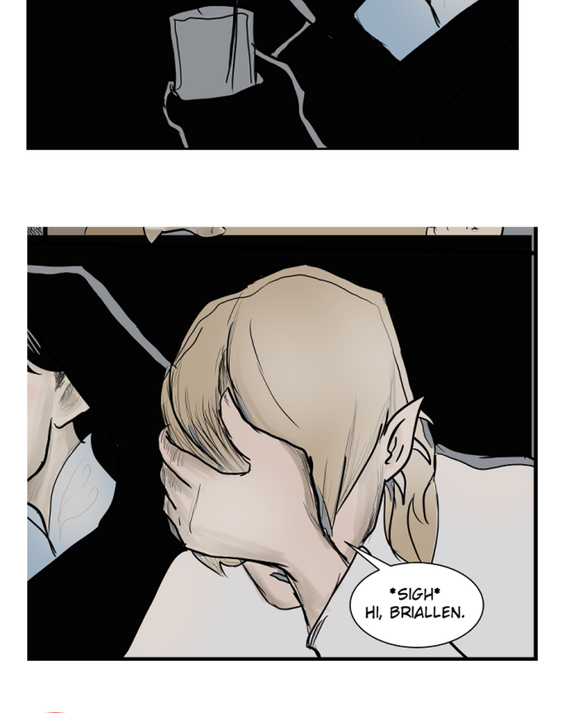


Oh, You Delightful Prankster, You!
Matthias just doesn't give a damn anymore, and I love it.
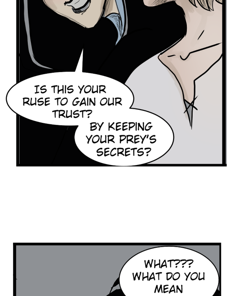
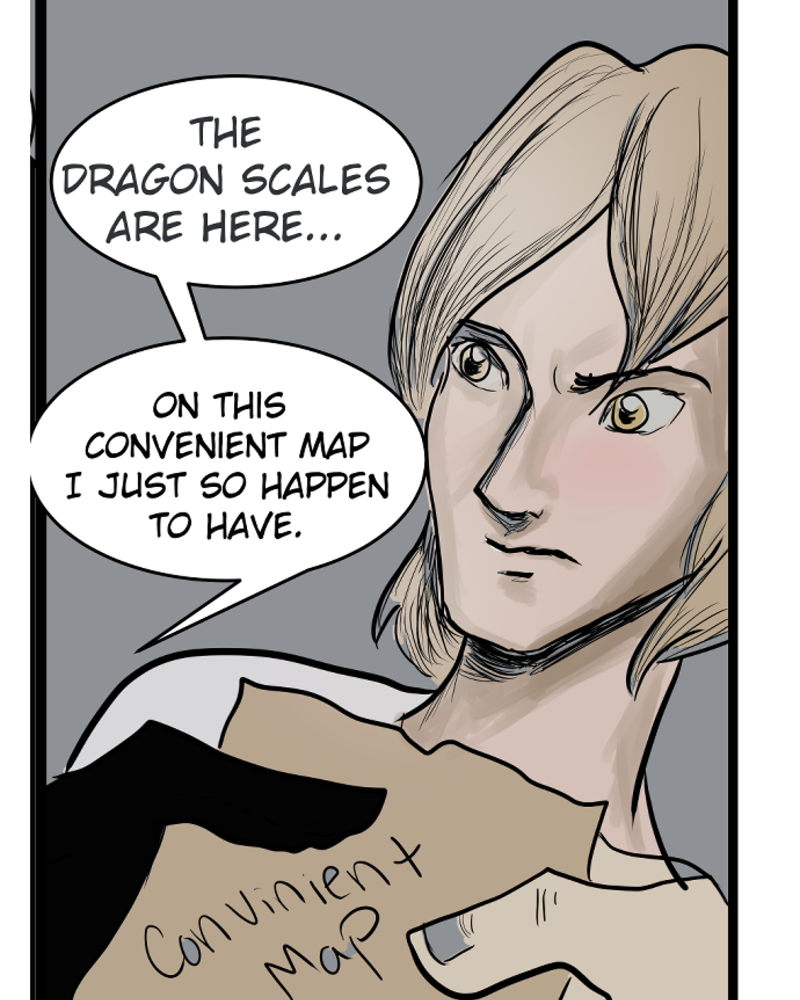
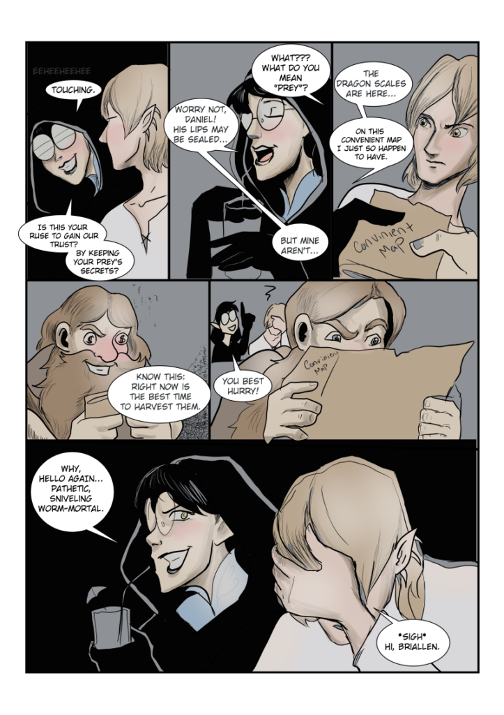
How Not to Color Comics
You know how sometimes when you make art, you forget one simple facet of color theory or something and the whole page looks off?
Well, in my case, I forgot that you want to have colors that illustrate the feeling or the atmosphere of a comic.
If I were to do this page again, I probably would have used more yellow hues or some other color that might give the feeling of "Greed". Backgrounds are hard, but I think looking back on some pages, this is something I'm going to try to make more of a conscious decision to do going forward. In my defense, I HAVE been studying linework and crosshatching (which I am having a TON of fun with). But this a lesson I'm trying to learn, failing is the best way to learn, and there were MANY failures in this comic up until now- every one a lesson.
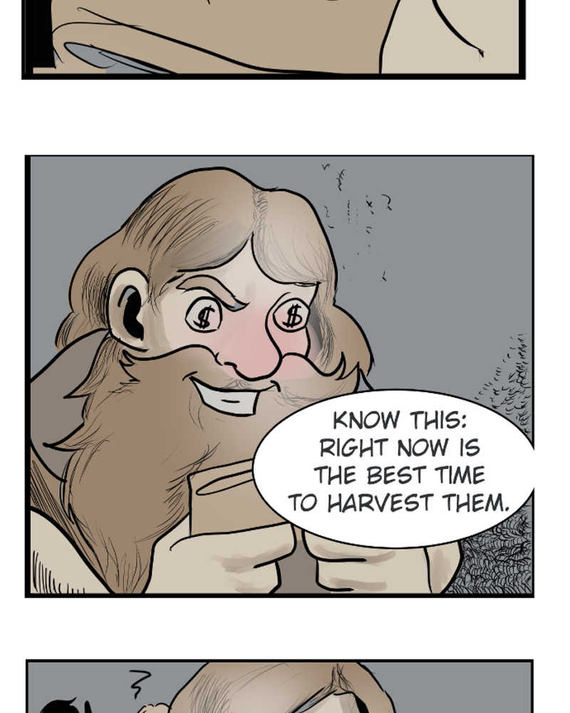
Still though, probably not best to reinvent the wheel. There are so many amazing color psychology guides out there used in digital marketing and brands. Actually, I also highly recommend Razbuten YouTube channel, as he did a couple of videos on how color was used in video games (he has an entire video on purple and why gamers tend to associate it with poison even though it doesn't really show up in nature as a "poisonous thing").
Most importantly, don't reinvent the wheel.
While it is best to think for yourself and figure things out on your own, for example, someone might have told you just to think about the colors you see in nature and what feelings they inspire you, color psychology has a lot of extensive research behind it and there are many great sources online!
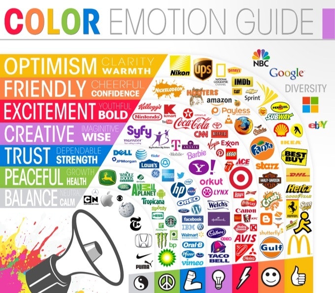
Image Credit: Huffington Post