Welcome back! Or, if you’re new, here’s Day 1:
Day 1 of the 30 Day Fantasy Background Challenge.
30 Fantasy Backgrounds for 30 minutes for 30 days!
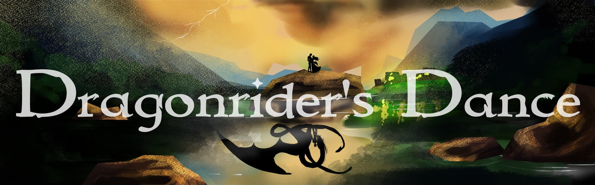
I’m using classic Disney movies as a point of reference because I really think Disney captures that fairy tale/fantasy world that I want to translate over to Dragonrider’s Dance.
In a classical art education, they have you try to copy “Old Master” paintings so that you can see exactly what they did to achieve that result.
From there, you can build on it from there instead of always floundering, having the picture perfect in your mind, only to get frustrated when the artwork doesn’t look at all how it does in your mind.
Now that I’ve written that, I think the next step after observing backgrounds from movies that inspired me, the next step would be to find who THEY might have studied and copy a few of those paintings…
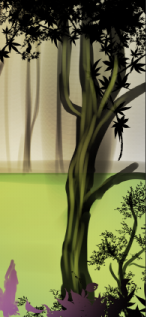
Day 2: The Forest Scene from Disney’s “Sleeping Beauty”
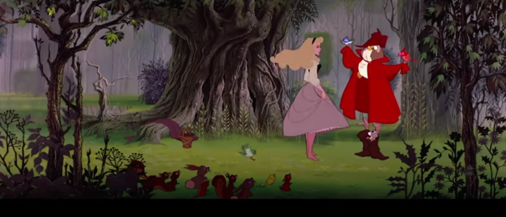
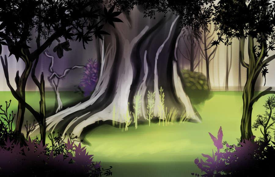
Nailed it! No really, I’m much happier with this than yesterday’s
What Have We Learned?
- Use more earth-toned washes/underpainting. I tried painting it in mostly black and white first, then moving on to purples, greens, and more greys when necessary (because those are the colors I “saw”). Looking at the reference and my work more closely though, I see mine is much more saturated and the “grey” is more prominant whereas in the reference it’s more subtle.
- When using “stamp” brushes, use at least 3 different kinds. I decided to take a digital shortcut and for the leaves in the foreground, I used the Decoration tool in Clip Studio Paint rather than handpainting them myself. I’ve always had mixed results because I feel like they’re so front and center against the painted look of everything else. I tried using 2 and varying the sizes and I feel like this looks much more natural. It makes sense too, because in nature, we don’t see one type of leaf everywhere, there’s many different sizes and shapes.
- In the background, don’t start by painting individual trees, have something that looks like this:

4. When painting individual plants, start with the leaves, then do a much more low-opacity stem.
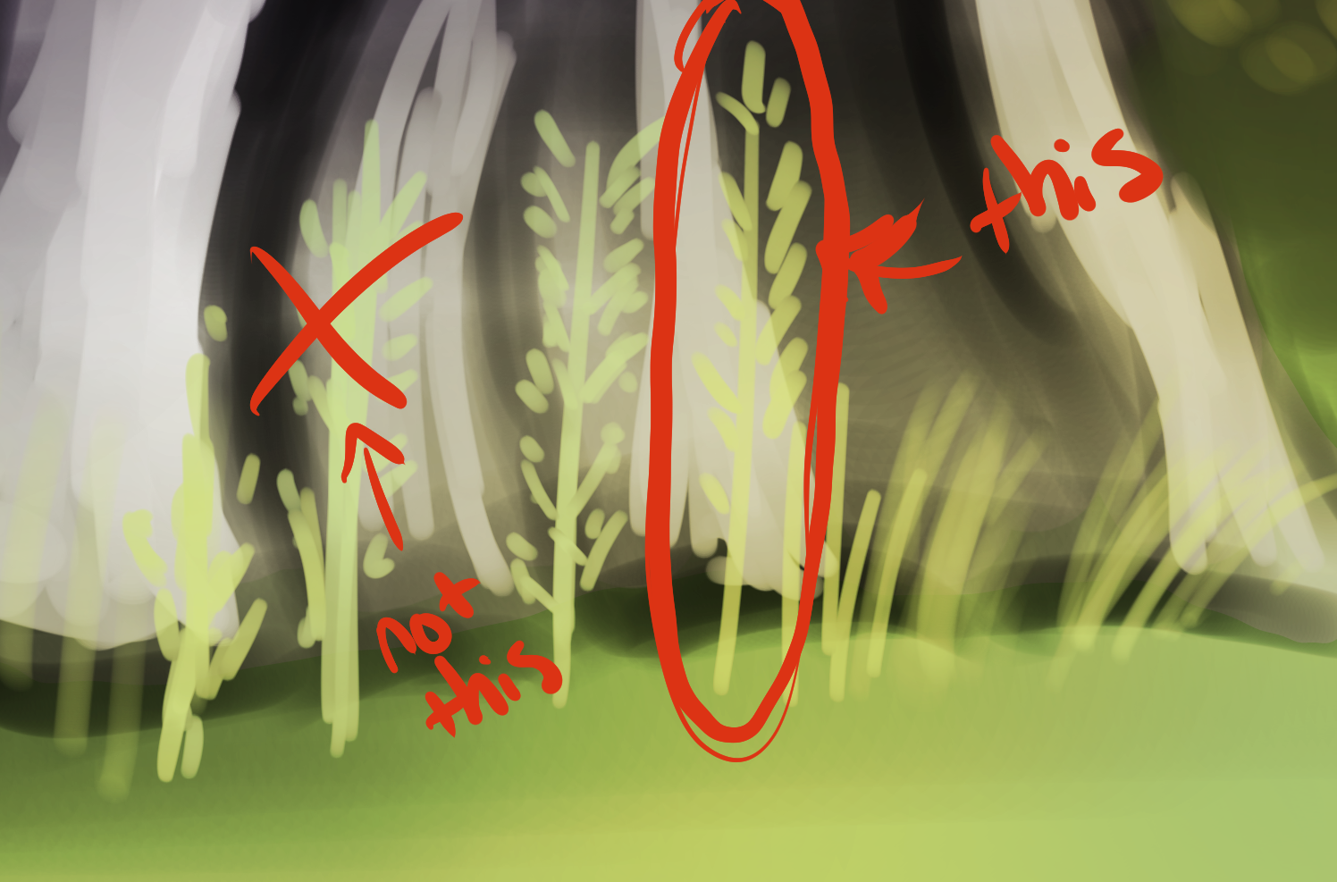
Just a handy little trick. Actually, it wouldn’t be a bad idea to draw a couple little grasses then save them as brushes for future projects, but yeah, my first instinct was to draw a thick stem and draw the leaves on it, but it looked really weird. Doing it the opposite way though- I was much happier with the result.
5. The Mask Tool is Your Friend
What I’m going to try doing tomorrow
- First off, definitely doing a dark brown underpainting instead of black and white. See if that has a more natural results
- Look at Clip Studio Paint’s library and see if I can find more leaf brushes
Day 3 —>
Thanks everyone for joining me today! If you would like to take part in this challenge, please put a link in the comments so I can see your progress! Please read my comic, Dragonrider’s Dance on dragonridersdance.com or Webtoon Canvas! It’s an exciting fantasy/fairytale/action comic about a world where dragons are all female and disguise themselves as princesses!