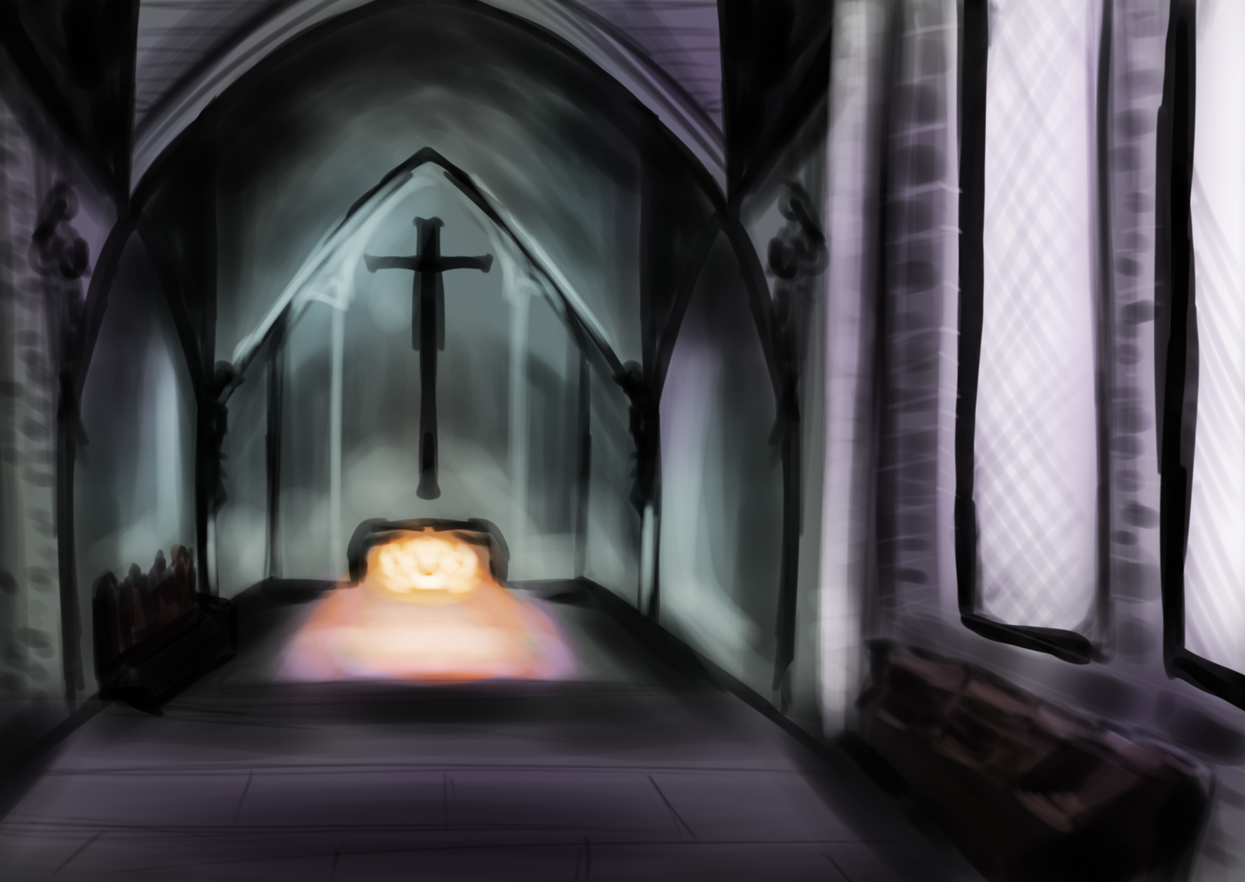
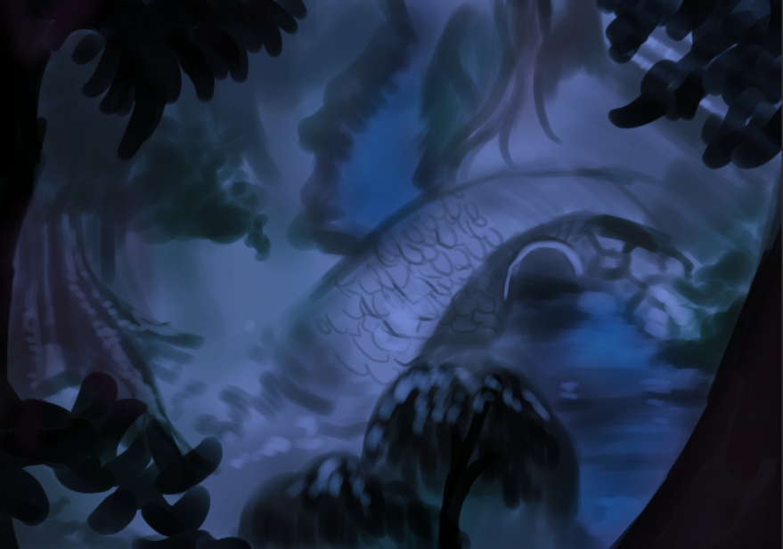
Interior Scene From Hunchback of Notre Dame’s Hellfire
Decided I wanted to move more into architectural spaces. Maybe some medieval cityscapes.
I was trying different brushes to give my version a less “clay” looking texture, but I can still there’s always room for improvement.
I hate saying, “long way to go”- to me, it’s always had a negative connotation of “not good enough”. We’re not allowed to say “not good enough” here.
We use the term, “Better than yesterday.”
We’ll see how tomorrow looks! Need to find another Gothic architecture landscape…
Reference
My Version
Thanks everyone for joining me today! If you would like to take part in this challenge, please put a link in the comments so I can see your progress! Please read my comic, Dragonrider’s Dance on dragonridersdance.com or Webtoon Canvas! It’s an exciting fantasy/fairytale/action comic about a world where dragons are all female and disguise themselves as princesses!
Wish I had a little longer than 30 minutes, but, that’s the excercise. Just focus for 30 minutes, not obsess over one thing for hours, then take lessons learned to the next day.
One of the most important things to remember is NOT to use the same brush for everything. Texture is a great way to remember this. for example, I used a soft, low-opaque brush for the water, but a more “bristly” brush for the grass. It’s the same advice you’ll get for traditional oil painting too.
Thanks everyone for joining me today! If you would like to take part in this challenge, please put a link in the comments so I can see your progress! Please read my comic, Dragonrider’s Dance on dragonridersdance.com or Webtoon Canvas! It’s an exciting fantasy/fairytale/action comic about a world where dragons are all female and disguise themselves as princesses!
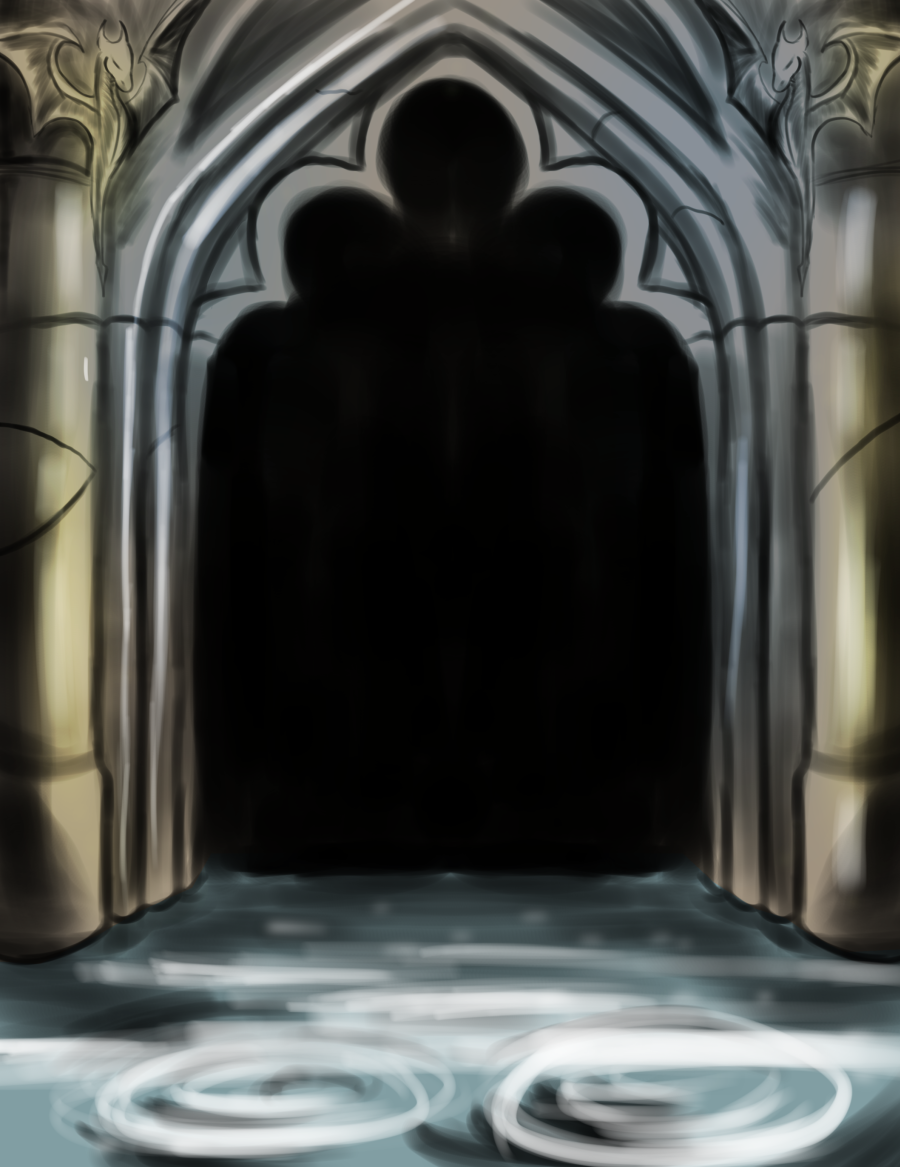
Decided to do something different today. This is the beautiful work by Anne Stokes. You probably have seen her work all over the internet. If you’re a fan of dragons, definitely so.
For today’s exercise, I drew the arch in this image
Thanks everyone for joining me today! If you would like to take part in this challenge, please put a link in the comments so I can see your progress! Please read my comic, Dragonrider’s Dance on dragonridersdance.com or Webtoon Canvas! It’s an exciting fantasy/fairytale/action comic about a world where dragons are all female and disguise themselves as princesses!
Day 5: “Through Heaven’s Eyes” from Prince of Egypt.
There’s going to be a bonfire at the end of Dragonrider’s Dance, so I tried to find the scene from Prince of Egypt. Another spectacular work of art. The screenshot is different from the one I actually ended up using because I was using the higher resolution Amazon movie, but they don’t let you take screenshots, so, here it is.
Thanks everyone for joining me today! If you would like to take part in this challenge, please put a link in the comments so I can see your progress! Please read my comic, Dragonrider’s Dance on dragonridersdance.com or Webtoon Canvas! It’s an exciting fantasy/fairytale/action comic about a world where dragons are all female and disguise themselves as princesses!
Welp! Today’s my first day at my new day job, so I don’t have a lot of time. BUT! It’s Swan Princess Again!
Here’s the Reference:
Here’s my version:
If you want to see yesterday’s artwork, click here! See you tomorrow!
Thanks everyone for joining me today! If you would like to take part in this challenge, please put a link in the comments so I can see your progress! Please read my comic, Dragonrider’s Dance on dragonridersdance.com or Webtoon Canvas! It’s an exciting fantasy/fairytale/action comic about a world where dragons are all female and disguise themselves as princesses!
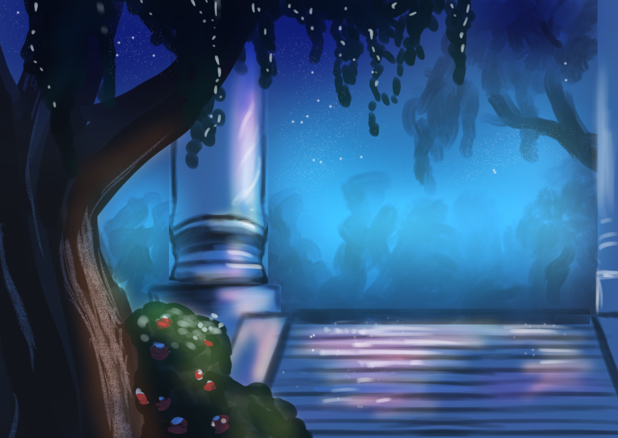
For this challenge, I decided to do a scene from the movie, Swan Princess. I found that starting with a house was probably not the best way to go. It was better to start with more simple, organic landscapes before moving on to things like houses and castles. That being said, I like this image because it has a stone bridge.
Another added challenge is there’s a birds-eye perspective view being used here.
Turns out, using brown as the underpainting worked. The painting I did here feels much more organic than yesterday’s. That being said, the bridge does look more silver than “stone”… this might be a limitation of the medium, but I’ll look into seeing how to create more organic stone features.
I think I might start using the eyedropper on the references more. I’ve noticed that I’ll “think” I have the right color, but seeing them side by side like that,
Actually, just for the heck of it, I put a saturated royal blue multiply filter on the image and now it looks closer.
I generally don’t like to go too dark. I learned that oftentimes, printers aren’t able to see really dark colors and will just print black or an ugly muddy color where you don’t want it. The goal here is to make as close of a copy as possible, not take it to the printers.
Another thing I noticed is the proportions are all wrong. Back in art class, we would need to use a canvas that is basically the same proportions as the reference. I’ll probably end up doing that.
Thoughts for tomorrow’s challenge:
Use the same dimensions as the reference. Feels like a no-brainer, but I was really reminded by how important it is to do that. I wasn’t able to draw EVERYTHING I wanted. The proportions ended up being kind of weird too. I was worried my version felt more claustrophobic than the reference.
Draw some breakdown lines over the reference. The bridge in my version is much bigger compaired to the reference, so I’ll draw some constructive lines over the reference to help get a better feel before drawing on the actual image
Ruins, stone bridges, and buildings that have an organic look are a great place to start.
Use the eye dropper tool on the reference to make sure you’re getting the right colors. That being said, only use it to “check your work”, don’t just take the eyedropper tool and use it in your art. You won’t be able to understand why the colors are like that when you move on to doing your own work, which is the whole point of this excercise.
Don’t be afraid to seek out critique. With these, I finally did the unthinkable: ask the internet for criticism. I posted this art and the reference on a private Digital Art Facebook group. They’re known for not holding back, but their critiques are always helpful with the exception of the occasional troll. I’ll let you know how that goes if I get any hits. I might do a post later down the road on how to deal with trolls… thankfully, I never deal with them, so I don’t know if I’m qualified…
Thanks everyone for joining me today! If you would like to take part in this challenge, please put a link in the comments so I can see your progress! Please read my comic, Dragonrider’s Dance on dragonridersdance.com or Webtoon Canvas! It’s an exciting fantasy/fairytale/action comic about a world where dragons are all female and disguise themselves as princesses!
30 Fantasy Backgrounds for 30 minutes for 30 days!
I’m using classic Disney movies as a point of reference because I really think Disney captures that fairy tale/fantasy world that I want to translate over to Dragonrider’s Dance.
In a classical art education, they have you try to copy “Old Master” paintings so that you can see exactly what they did to achieve that result.
From there, you can build on it from there instead of always floundering, having the picture perfect in your mind, only to get frustrated when the artwork doesn’t look at all how it does in your mind.
Now that I’ve written that, I think the next step after observing backgrounds from movies that inspired me, the next step would be to find who THEY might have studied and copy a few of those paintings…
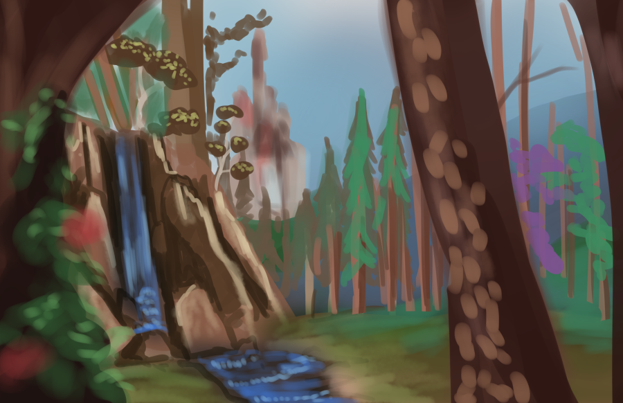
Day 2: The Forest Scene from Disney’s “Sleeping Beauty”
Nailed it! No really, I’m much happier with this than yesterday’s
What Have We Learned?
Use more earth-toned washes/underpainting. I tried painting it in mostly black and white first, then moving on to purples, greens, and more greys when necessary (because those are the colors I “saw”). Looking at the reference and my work more closely though, I see mine is much more saturated and the “grey” is more prominant whereas in the reference it’s more subtle.
When using “stamp” brushes, use at least 3 different kinds. I decided to take a digital shortcut and for the leaves in the foreground, I used the Decoration tool in Clip Studio Paint rather than handpainting them myself. I’ve always had mixed results because I feel like they’re so front and center against the painted look of everything else. I tried using 2 and varying the sizes and I feel like this looks much more natural. It makes sense too, because in nature, we don’t see one type of leaf everywhere, there’s many different sizes and shapes.
In the background, don’t start by painting individual trees, have something that looks like this:
This is what the first layer in the background kind of looks like, basically, I just took the round brush with a lower opacity and just layered brush strokes on top of eachother, it looks more like a real forest, not to mention takes much less than time, than trying to paint each indiviudal tree.
4. When painting individual plants, start with the leaves, then do a much more low-opacity stem.
Just a handy little trick. Actually, it wouldn’t be a bad idea to draw a couple little grasses then save them as brushes for future projects, but yeah, my first instinct was to draw a thick stem and draw the leaves on it, but it looked really weird. Doing it the opposite way though- I was much happier with the result.
5. The Mask Tool is Your Friend
On this guy, I painted a black tree in the foreground, then using the mask tool and eyedropper, I took a lighter color from the image and painted the bark. Because it’s a mask, it wasn’t going to move off the tree layer.
What I’m going to try doing tomorrow
First off, definitely doing a dark brown underpainting instead of black and white. See if that has a more natural results
Look at Clip Studio Paint’s library and see if I can find more leaf brushes
Thanks everyone for joining me today! If you would like to take part in this challenge, please put a link in the comments so I can see your progress! Please read my comic, Dragonrider’s Dance on dragonridersdance.com or Webtoon Canvas! It’s an exciting fantasy/fairytale/action comic about a world where dragons are all female and disguise themselves as princesses!
I never liked painting landscapes or buildings. It just was never interesting to me. I prefer to go out in nature and STAND in it, maybe draw some cool little details in the land like leaves, rocks, and whatnot, but no, I never really liked painting landscapes and the few times I was inspired to make one, I was never happy with how it turned out.
That all changed when I started seriously working on Dragonrider’s Dance.
30 Backgrounds in 30 days for 30 minutes!
Why It’s Important To Be Good At Backgrounds
I wanted my characters to have beautiful places to stand in, so I spent some time working on landscapes, even having some panels that are just looking at different parts of the environment, no dialogue, nothing, just giving readers the chance to take a breath and enjoy the scenery.
There’s also the obvious, like if you want a career in the arts, it’s good to have some impressive backgrounds in your portfolio, but really, I think it’s part of the experience of giving your audience the escapism they so desperately need. A beautiful place with gorgeous waterfalls, ancient ruins, even sentient trees are an important part of the experience. I’m providing a link to a YouTube video that talks about Miyazaki’s films and how he captures that feeling perfectly.
Why 30 Minutes?
Obviously, the backgrounds I’ll be using for reference took the artists longer than 30 minutes, but just for our purposes, forcing yourself to paint the most important details in a limited amount of time does several things. The goal isn’t to make 30 portfolio masterpieces, it’s only to improve at a specific skill. In this case, Fantasy Landscapes and Environments.
Helps you learn how to make deadlines better
It’s a good way of taking note where you might be struggling, then moving on and applying those lessons to the next day.
It’s a good warmup excercise in the morning, if you’re spending 30 minutes making essentially practice art that you don’t care if it looks like a masterpiece just as long as it looks better than yesterday, then it’s a good way to before moving on with other art things you’re working on.
If you’re doing this for a comic or animation, fortunately, people are only looking at the scene for just a few seconds anyway, by learning how to draw the most important, obvious things first, you can better achieve that experience without wasting so much time getting hung up on things that people aren’t going to notice anyway.
It will help you better not compare yourself to others, but to who you were yesterday.
Day 1: The Landscape/Cottage From Beauty and the Beast
Reference:
ArtNailed it!
What I Learned:
Well first off, I learned that I forgot how to do basic art. But that’s okay, this is Day 1 and I was just experimenting and painting what I saw.
Don’t paint background details first. I got too hung up on the house first. I started with making a white shape, then trying to block in the roof, the door, basically the details, but none of the rest of the landscape was getting done. Basically, I was trying to frost the cake before it was even baked.
Paint the buildings last. When painting mostly nature scenes with a cottage or some kind of man-made building, spend 5 minutes painting the nature first, the big blocky bits of color, the leaves before the trunks, etc. Essentially, start big and get smaller.
Have a very simple color pallet. 5 Colors or less. I did notice the trunks of the trees were very similar in color to the roof.
Just paint with normal brushes. There are so many tools when painting digital art. My mistake was using the lasso tool to get that more inorganic, building look, but it looks really weird.
Paint the whole thing in black and white first. Or brown and white… I mind end up trying that tomorrow. Notice how the volume in my example is very weird. It’s best to get the shadow and lighting and shadow down first before moving on to color.
For Day 2, Click here!
Thanks everyone for joining me today! If you would like to take part in this challenge, please put a link in the comments so I can see your progress! Please read my comic, Dragonrider’s Dance on dragonridersdance.com or Webtoon Canvas! It’s an exciting fantasy/fairytale/action comic about a world where dragons are all female and disguise themselves as princesses!