What is this?
A non-Disney movie?
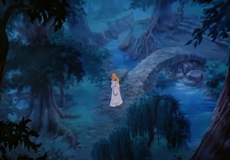
For this challenge, I decided to do a scene from the movie, Swan Princess. I found that starting with a house was probably not the best way to go. It was better to start with more simple, organic landscapes before moving on to things like houses and castles. That being said, I like this image because it has a stone bridge.
Another added challenge is there’s a birds-eye perspective view being used here.


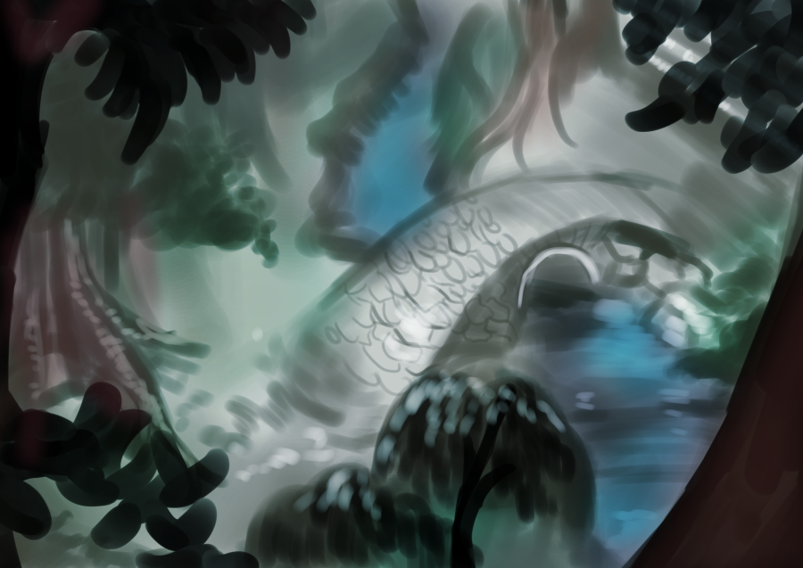
Turns out, using brown as the underpainting worked. The painting I did here feels much more organic than yesterday’s. That being said, the bridge does look more silver than “stone”… this might be a limitation of the medium, but I’ll look into seeing how to create more organic stone features.
I think I might start using the eyedropper on the references more. I’ve noticed that I’ll “think” I have the right color, but seeing them side by side like that,
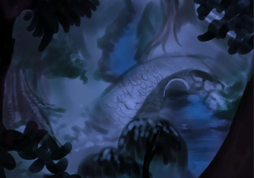
Actually, just for the heck of it, I put a saturated royal blue multiply filter on the image and now it looks closer.

I generally don’t like to go too dark. I learned that oftentimes, printers aren’t able to see really dark colors and will just print black or an ugly muddy color where you don’t want it. The goal here is to make as close of a copy as possible, not take it to the printers.
Another thing I noticed is the proportions are all wrong. Back in art class, we would need to use a canvas that is basically the same proportions as the reference. I’ll probably end up doing that.
Thoughts for tomorrow’s challenge:
- Use the same dimensions as the reference. Feels like a no-brainer, but I was really reminded by how important it is to do that. I wasn’t able to draw EVERYTHING I wanted. The proportions ended up being kind of weird too. I was worried my version felt more claustrophobic than the reference.
- Draw some breakdown lines over the reference. The bridge in my version is much bigger compaired to the reference, so I’ll draw some constructive lines over the reference to help get a better feel before drawing on the actual image
- Ruins, stone bridges, and buildings that have an organic look are a great place to start.
- Use the eye dropper tool on the reference to make sure you’re getting the right colors. That being said, only use it to “check your work”, don’t just take the eyedropper tool and use it in your art. You won’t be able to understand why the colors are like that when you move on to doing your own work, which is the whole point of this excercise.
- Don’t be afraid to seek out critique. With these, I finally did the unthinkable: ask the internet for criticism. I posted this art and the reference on a private Digital Art Facebook group. They’re known for not holding back, but their critiques are always helpful with the exception of the occasional troll. I’ll let you know how that goes if I get any hits. I might do a post later down the road on how to deal with trolls… thankfully, I never deal with them, so I don’t know if I’m qualified…
Thanks everyone for joining me today! If you would like to take part in this challenge, please put a link in the comments so I can see your progress! Please read my comic, Dragonrider’s Dance on dragonridersdance.com or Webtoon Canvas! It’s an exciting fantasy/fairytale/action comic about a world where dragons are all female and disguise themselves as princesses!


